How color works is probably one of the most common topics between clients and designers. There are a lot of variables, especially if you’re sending something to be professionally printed, or trying to match things between print and web. But while color can seem like a complex concept, in reality it’s pretty simple.
Every color can be defined and controlled by three different settings: hue, saturation, and brightness.
This is true whether you’re working in CMYK for print or RGB for web. If you’ve ever used a color picker like below, you’ve seen these concepts laid out, even if you didn’t quite realize what they were called or did. Understanding how these settings work, and how you can adjust them to get the color you want (or tell your designer what adjustments to make to get the color you want) can make discussion in the design process a lot easier. Let’s dive in.
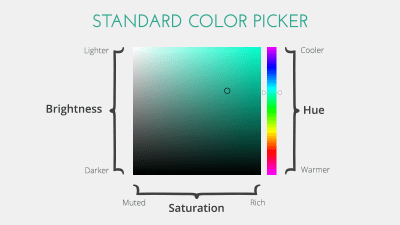
Hue
This is the main component people think of when they think of color – where along the rainbow you’d find it. Terms like red, yellow, and green come from the hue. This is also where you’ll hear terms like warm color or cool color. Warmer colors are those at the red end of the spectrum – generally red, orange, yellow, and maybe some pinks and purples depending on their tone. Cooler colors are those at the blue end of the spectrum – generally greens, blues, and most purples. You can have a warm green or a warm purple, or a cool yellow – areas where the warm and cool sides of the spectrum overlap. But as a general guide, what I laid out above will do.
On the color picker, hue is selected by moving the slider on the rainbow gradient up or down to get the location you want. And while naming a spot on the rainbow does narrow in on a color, it doesn’t do the whole job. Each hue (or slice of the rainbow) has thousands of variations, depending on where you place the next two settings.
Saturation
This is how strong the pigment of a color is. Think of it like food coloring. If you have a glass of water, and add just a drop or two of food coloring, it’s not going to change the color of the water that much. Just the merest hint of the color will appear. That’s a muted color, the lower end of the saturation spectrum. However, if you add a whole bunch of food coloring, enough so that the glass of water matches the pure food coloring itself, then you’re at the other end of the spectrum – the most saturate or rich a color can be. On the color picker, you move the selector straight left for less saturation, and straight right for more saturation.
Take a look at this graphic:
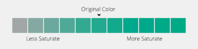
The ONLY setting that is changing between the different blocks is the saturation – hue and brightness are constants, which is why it’s not getting warmer or cooler, or lighter or darker. It’s just adjusting the amount of pigment. The farther from gray you get, the more saturation your color has.
Brightness
This is how light or dark a color is, or how much black or white you’re adding to a color to make it lighter or darker. On the color picker, you’d move the selector straight up to make a color brighter, or straight down to make it darker. This is broken down into two more terms:
- Tints: When you add white to a color to make it lighter.
- Shades: When you add black to a color to make it darker.
Another handy graphic for you:
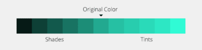
Again, the ONLY setting that is changing here is brightness – hue and saturation are constants, which is why it’s not veering towards yellow or blue, or getting any grayer. We’re simply adding black or adding white to change the brightness.
Hopefully this clears up how color works! Now, when your designer shows you a concept and the green color just isn’t quite right, you’ll know how to talk to her to adjust it. Requests like “a slightly warmer hue with a more muted tint, please” are much more likely to get you to the color you want than the more vague “it needs to be lighter.” Happy color trails!
Is it more clear how color works now? Do you feel any of the terms need more in-depth explanation?
This post is part of my Decoding Design series, where I explain and explore terms and concepts specific to the design world for non-designer clients and readers.
The post Decoding Design: How Color Works appeared first on Studio Guerassio.


